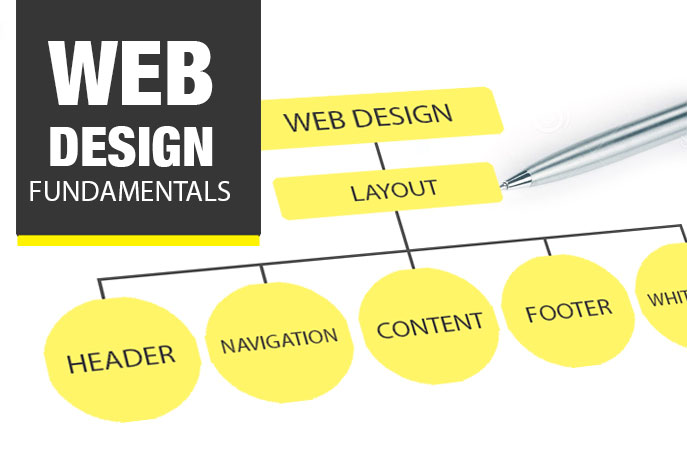
If you’ve ever researched web design principles, you’re probably more than familiar with the following attitude: “Web design is just so easy these days. With lightning-fast internet speed and sophisticated browsers, designers hardly have to deal with any of the restrictions that shaped the early days of the web. A website is, more than ever, a designer’s canvas.”
There are some fundamental Key points of web designing :
Grid System
One of the Most important key points is grid system . your design should be managed every single pixel should be manageable. This management should be done using Grid System. Grid System is better way to manage your Content.
Visual Hierarchy
Visual Hierarchy is another most important Key point in web designing. Visual hierarchy means all the visual effects , fonts, images and designs should be in same hierarchy. I you use different fonts from your main page it will look irritating. so you should maintain hierarchy of all type of visual data.
Web Safe Fonts
In 2014, the term “web-safe fonts” already feels like something of an anachronism. Back in the early days of the internet, browsers supported a very limited number of fonts—typically just ones that were already installed in users’ word processing software—and if you deviated from these, some visitors would just wind up seeing random symbols.
Today, it is still true that certain fonts are supported by most browsers while others fonts are not, but the number of web-safe options has exploded thanks to the adoption of what is known as @font-face embedding in most modern browsers. Indeed, many designers complain of having too much to choose from.
Fee-based font services include Typekit, WebINK and Fontspring. You can find nice free fonts, too, if you do a little searching through free services like Google Web Fonts.
Images and colors
The principles of image and color placement are not especially unique to web design, so we won’t go into too much depth here. The main maxim to keep is: don’t overdo it.
For colors:
- Keep your color palette minimal
Like fonts, just stick to 2 or 3. They should of course echo the host’s branding, while serving to highlight important areas, as noted in the “visual hierarchy” section. - Consider color blindness
One other consideration worth keeping in the back of your mind is the fact that something like 5% of the (male) population is colorblind, so watch out with your color pairings.
For images:
- Keep movement minimal
Avoid images that move. Resist the urge for flash. Even .gifs are highly questionable, unless executed with the utmost skill. In general, studies show that viewers much prefer websites that keep still. - Choose images thoughtfully
Don’t use images simply as a way to fill space; visitors will pick up on this immediately and may lose interest in your page. Instead, only use images which communicate useful information—illustrating accompanying text or explaining something about a product being described. - Always abide by all stock image licensing restrictions
Be aware of the licensing restrictions associated with your images. Most images are copyrighted, meaning that you or your client will have to pay to use them, according to your needs. - Keep file sizes small
Make sure your image sizes are as low as possible (web resolution is 72 ppi). Images often account for 60% or more of a web page’s size/loading time.


